In this issue: 3 month update! Thoughts on shorter issues, experimental content, free digital & physical art. Plus, status on my animated short Chamoe.
—
“This, yes. But also that.”
—Susan Sontag, in The Threepenny Review
Direction
New and abiding friends! Welcome to issue 07.
The Line Between (TLB) is a biweekly newsletter where you can peek into my day to day as I animate, paint, and solve problems. Every choice I make, including what I consume and say no to, feeds into the stories I tell. I hope you walk away from each issue with a nugget of something that feeds you, makes you feel less alone, or otherwise moves you.
It’s been 3 months since launch and I’ve reached my pre-paywall subscriber goal!
Starting in Issue 08, some of the content will be available to paying subscribers (members) only. Thank you so much for believing in me and helping me get TLB off the ground!
To be clear, the current idea is for everyone, even those on the free plan, to receive most issues. Members will simply have access to more content per issue, bonus issues, and activities like livestreams. I hope you still find value in the free content that you keep reading. You can share, upgrade to paid, or donate as you’re able—knowing that you’re making it possible for me to do what I love most.
Shorter issues
Going a little meta today to talk about the design and direction of this very newsletter.
I consider TLB an art project itself; yet another creative problem I’m iterating on. I’m going to play around with structure and introduce interactive content like 3-panel illustrations (triptychs) that I’ll invite you to caption. I’ll almost always share progress on my animated short Chamoe. But some future issues will be significantly shorter in both length and read time.
The idea is to add levity and texture into the mix while still providing consistent updates on a WIP.
Each issue to date takes 7 minutes to read, on average.
Lower word count is not a goal in itself for future issues btw—it’s just that the new structure and content types by nature will likely result in shorter reads.
FWIW, I already average under 1400 words per issue, or about 4.5 minutes to just read the text. My longest is 1676 words, requiring about 5.5 minutes to read just the text.
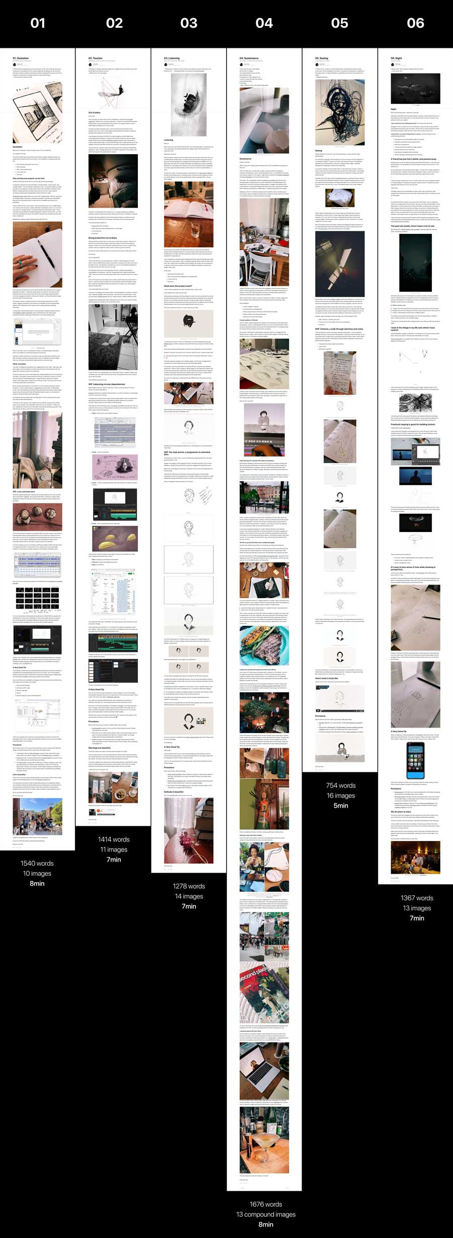
TLB is also fairly image-heavy, which arguably makes for easier reading but does add to read time. Images are also the main reason I regularly hit email load limits.
Lastly, since this is a new publication, there’s been a need for more context, which also adds to length. This will lessen over time.
I would of course love to deliver something interesting in 3, 2, or even just 1 minute of a reader’s time! What a great challenge. Stay tuned.
Variable structure, experimental content
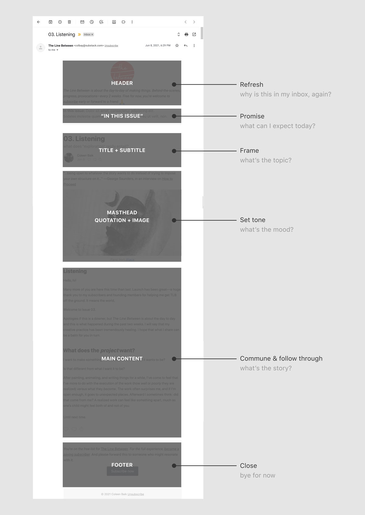
TLB has a certain content structure with each section serving a specific function. It’s meant to set expectations and invite you into what I hope feels like a gathering at a friend’s home, intrigued and equipped to engage in conversation.
I like this general flow and won’t dispense completely with structural patterns. I will introduce more types of content and structure, and have those become a part of a larger pattern in the overarching TLB experience.
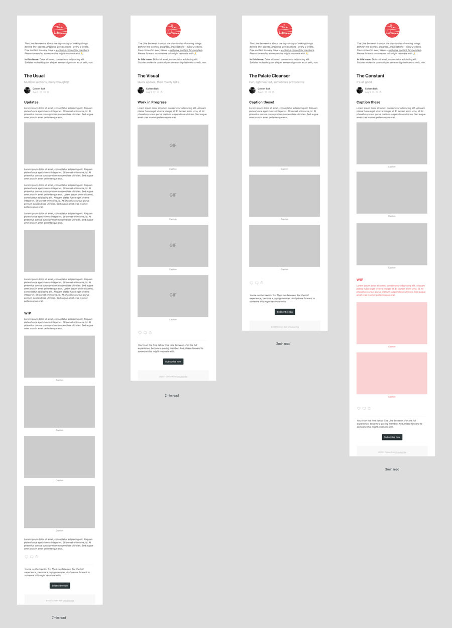
For example, maybe TLB issues come in different but eventually familiar shapes and sizes. Some ideas (Figma community template for your own brainstorms):
The Usual
the multi-section, expository version you’re accustomed toThe Visual
WIP via GIFs or photos, that’s it, that’s the whole issueThe Palate Cleanser
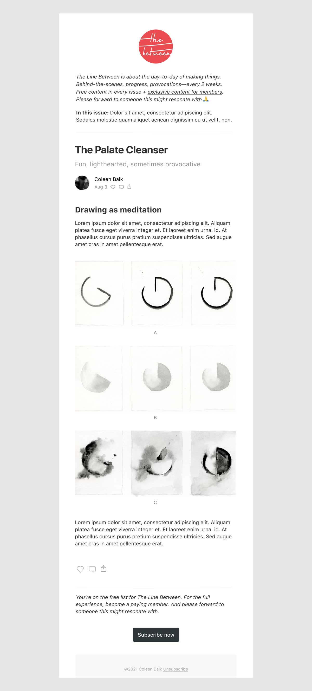
e.g., visual puzzles to caption! environmentally-friendlier NFTs! Micro-animations to Dead or Alive’s You Spin Me Right Round!The Constant
Perhaps an update on a main WIP is something you can expect in every issue.
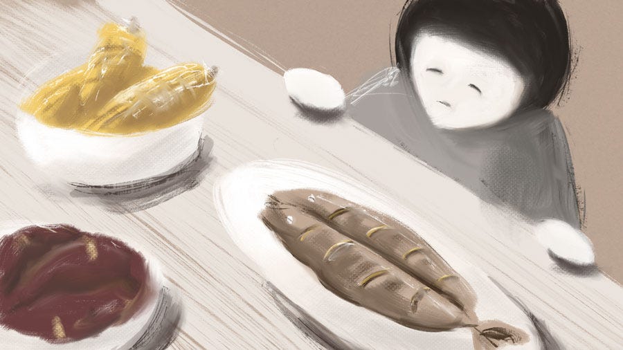
The Palate Cleanser is the most novel of the bunch. Examples of Palate Cleansers could include an invitation to: caption a triptych, walk through an exercise to break out of an afternoon slump, or to meditate on a series of stream-of-consciousness illustrations.
Part of why I’m shifting in this way is because I’m listening and feel organically pulled to do so. My creative practice also happens to include a wide variety of interests and routines, and I think it’s useful to share that with you.
It’s just fun to mix things up, too. Contrast refreshes while rhythm anchors. I think these are all important and necessary when we make and consume.
Lastly, I’m intrigued by single-focus consumption experiences which can deliver so much, quickly, with deceptive ease. So I want to start including them as a part of the cumulative TLB experience.
Free art
As you may have gathered, I’m interested in a broad range of subjects and modes of making: ceramic coasters to letterpress prints to augmented reality illustrations with physical keys are just a few examples.
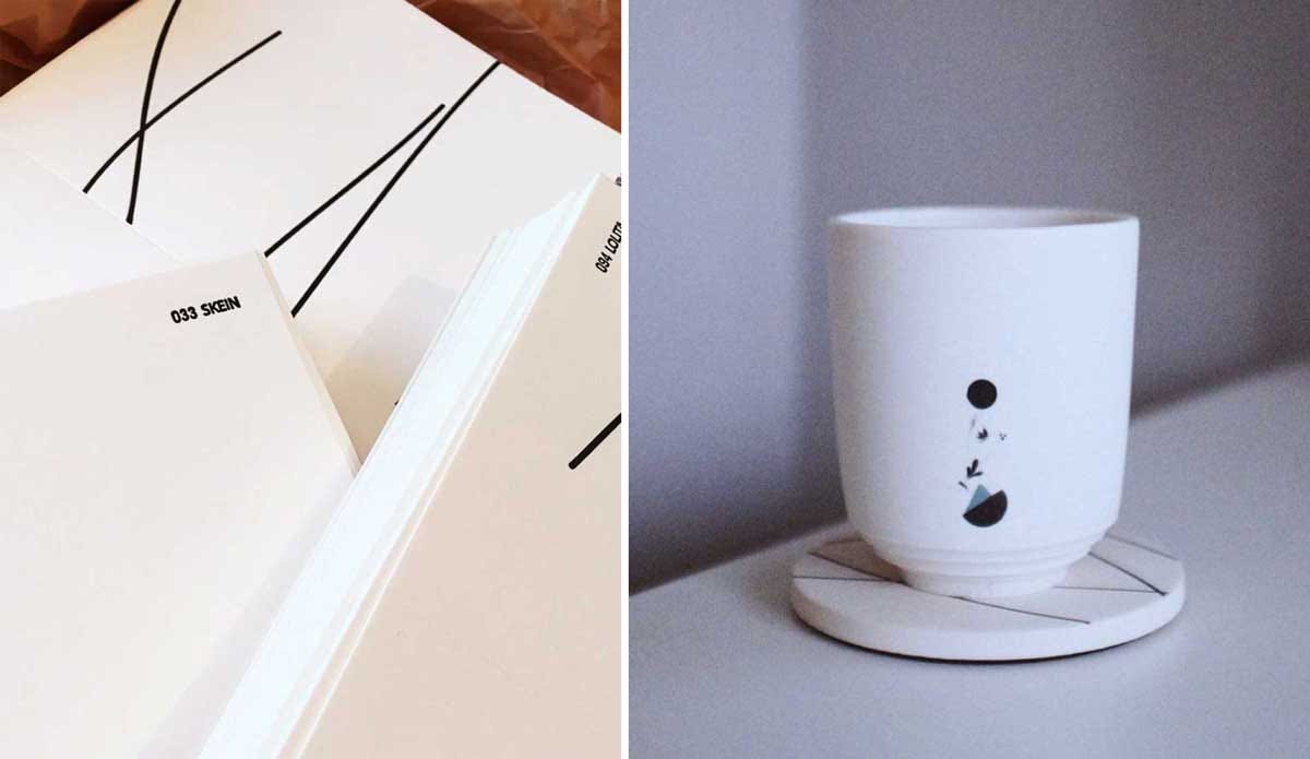
I paint regularly, enjoying the meditative passing of hours. I like connecting art to every day routines such as cooking meals. I like going off-piste, trying new things, doing the same thing repeatedly while changing just one aspect of it to see what happens.
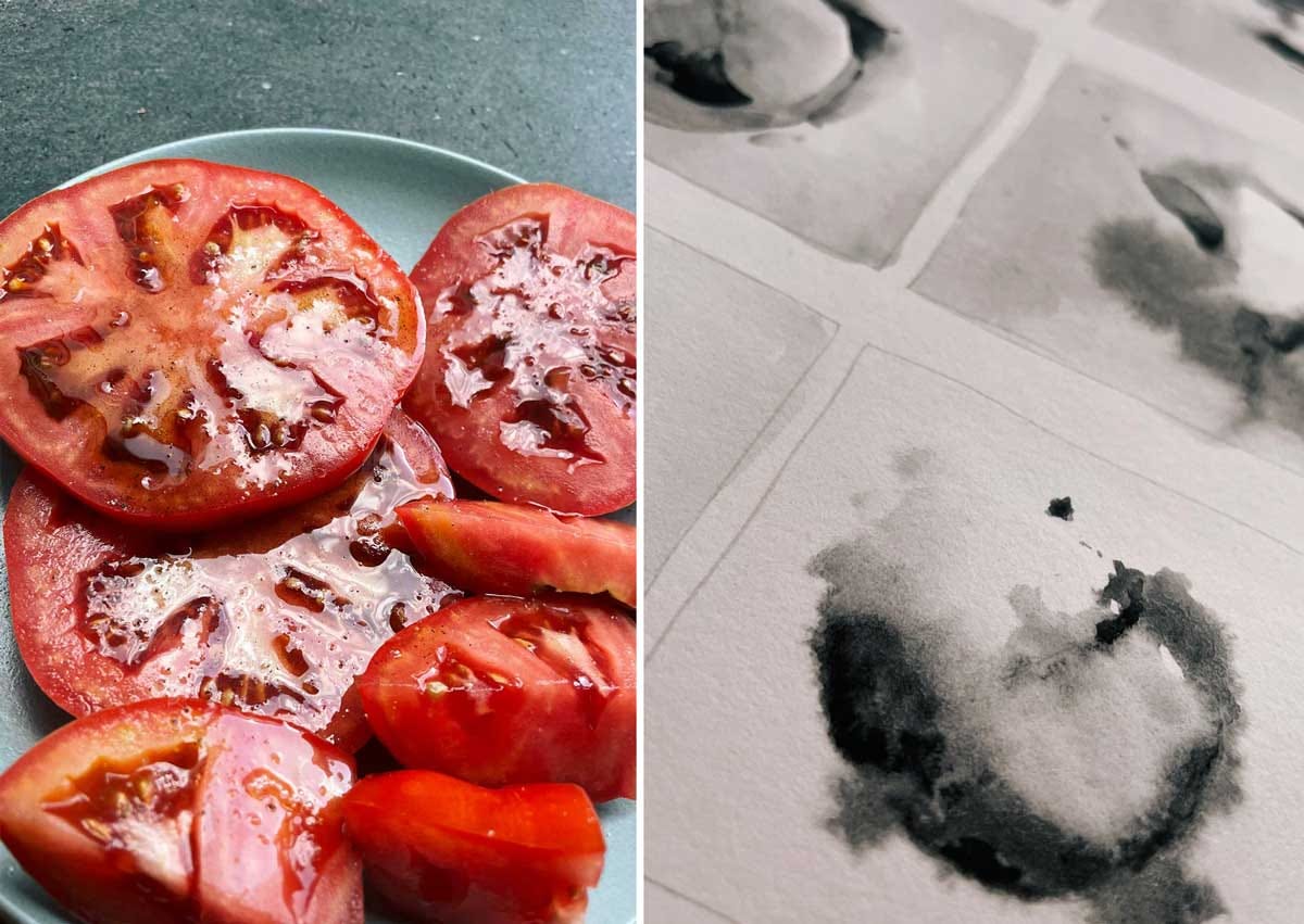
Every now and again, I’d like to share these inclinations with readers of The Line Between as art you can hold in hand, or art you can display for personal use.
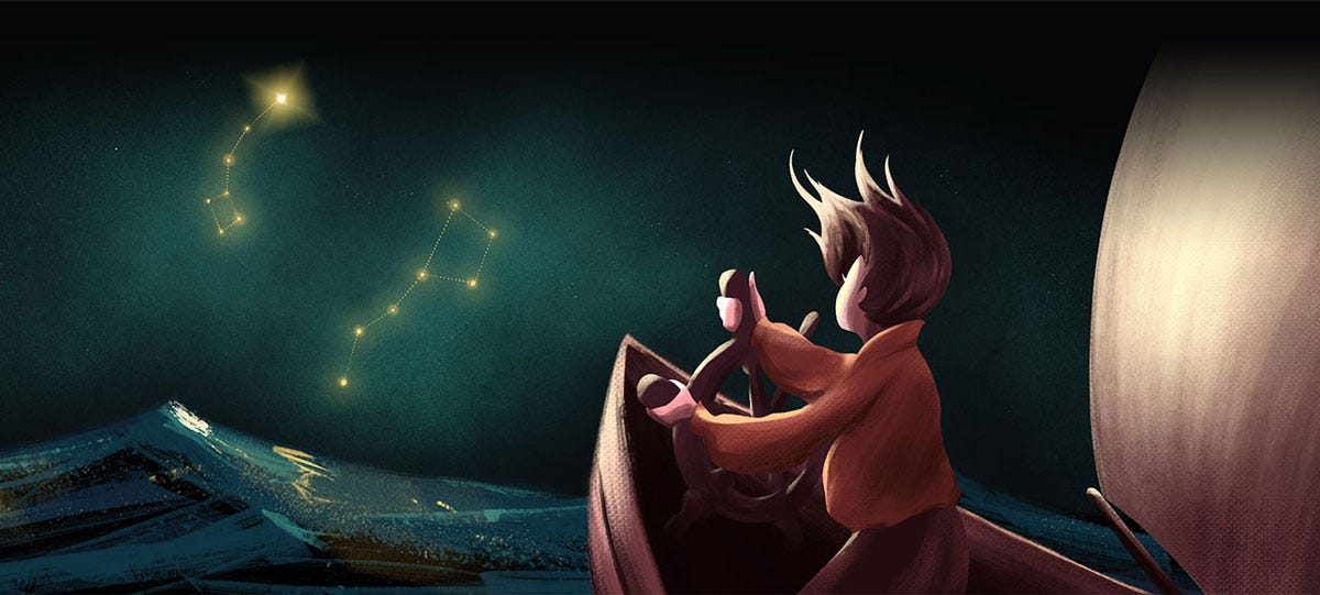
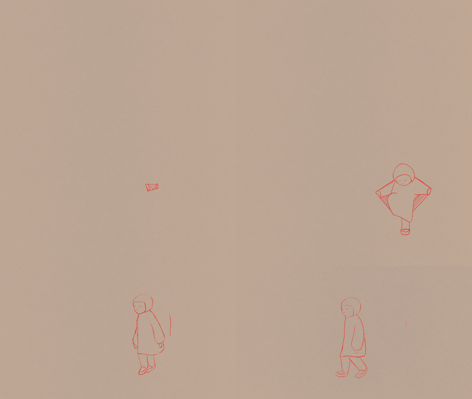
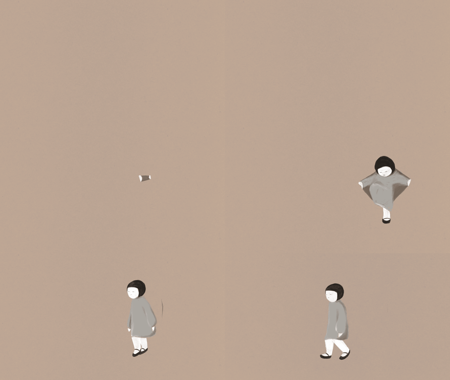
To start, I’ll send a hi-res version of the illustration that appears as at the head of this issue (cropped for desktop) to the first subscriber who comments “Polaris!” to this post. Feel free to like that comment so that I can better gauge interest for future shares.
WIP
As promised, a quick update on my animated short Chamoe, which I began sharing progress on in Issue 01.
I was away all last week without my Cintiq, so I’m still working on Sequence 02. I finally got some color work done yesterday, putting down base layers. The lead-time on the segment is intentional and makes more sense when concatenated with Sequence 01. I’ll share the story so far, with sound, when Sequence 02 is completed. Hopefully next issue!
A Very Good Tip
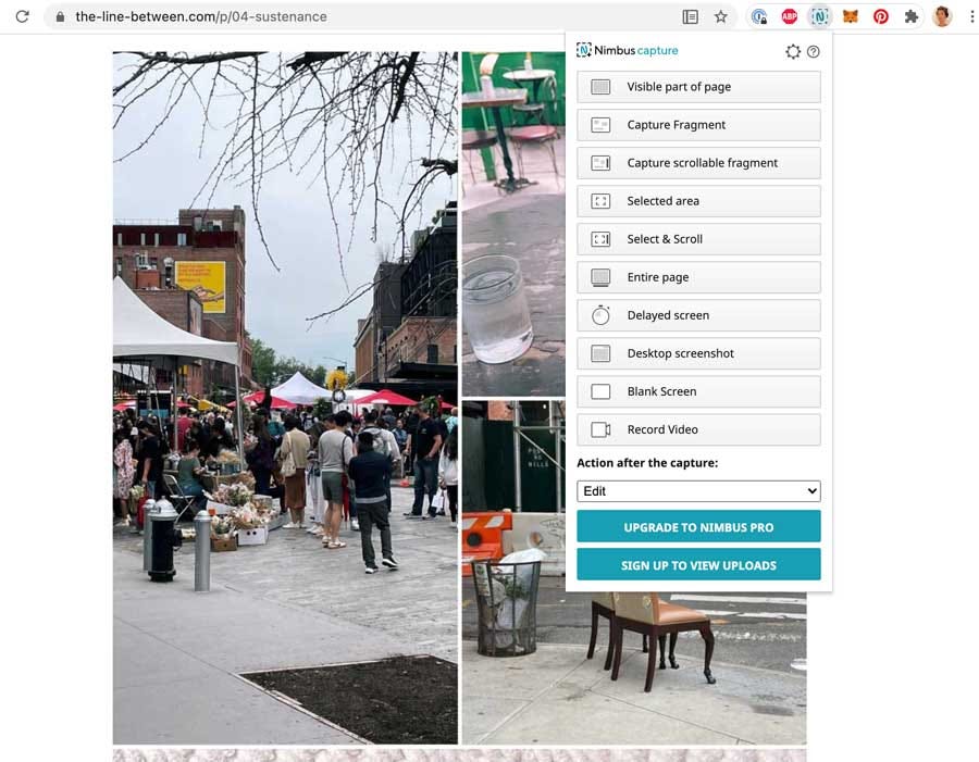
If you’re curious how I captured entire web pages to show differences in TLB issue length, I used the Nimbus chrome extension. Super easy to use, and you can save in a variety of formats, including PDF. Handy for long page captures.
A newsletter’s form itself is a problem to be solved,
a thing to be designed. These are my thoughts on its first iteration.
TLB isn’t just about animation, design, or routine. It’s about how someone (hi! 👋) solves problems, sometimes indirectly but no less impactfully through things like meditation, consumption, physical movement, and interruptions. Ultimately, for a mind and body progressively better prepared to make beautiful things. (Say that 10 times fast.)
My hope is that this supports you as you work on your own products or processes—a digital app, a painting, or a personal relationship—as I share how I do and see things.
At the least, I hope it’s fun or interesting to read. I hope it makes you laugh sometimes, that you walk away with a nugget of something—an idea, a shift in perspective, an inspiration. But always, a feeling of camaraderie and communion.
Much to look forward to!
Until next time. (And stay safe! Delta be no joke.)



I think, and re-think, and re-think again, the structure of my newsletter often, and have sometimes thought that maybe I was overthinking, that I should just present it loosely and in an ad-hoc manner. But I have honestly found that quite impossible—it probably goes against my very nature! So thank you for this, as I've been thinking, too, of how to arrange it within a structure that still allows for variation and experimentation. Looking forward to more of The Line Between and how it evolves
oolaris!