“…being open to whatever the story wants to do instead of trying to impose your own structure on it…” —George Saunders, in an interview on How to Proceed
Listening
Hello, hi!
Many more of you are here this time than last. Launch has been great—a huge thank you to my subscribers and founding members for helping me get TLB off the ground. It means the world.
Welcome to Issue 03.
We’re just about coming to the end of these sweet pre-dog-days of New York where you can still keep the windows open. Just after sunset, breezes waft in through the trees to skim over my face and bare arms, probably the tactile equivalent of ASMR for me. The light slowly turns blue. Soon, cicadas will emerge. And deeper into summer, the fireflies will flicker on. They make up for having to turn on the air conditioner, which is deafening in so many ways and makes me feel cut off from life, as if I were in a bomb shelter or a tomb.
The past two weeks, I’ve been focusing on a style primer for my new project, Chamoe. A lot about this animated short is uncharted territory and there are new problems to solve. It’s a bit like sitting in a room full of gnarled things I have to untangle before I can put them together.
At this juncture, the novelty of an idea and the shine of a vision can be usurped by questions and the tedium of labor. If I’m not fully present, these can also usurp me, and the little germ of the idea. And that’s especially a shame for the germ, the thing whose realization I’m responsible for.
I took a step back at one particularly challenging point last week and thought about what it means to be “fully present” when I’m making something. What it means to listen to the work. How I might come to the table with more respect for the idea, be more responsive to signals, but also have an opinion and know the difference between conviction and rigidity. Tricky, tricky.
In this issue:
What does the project want?
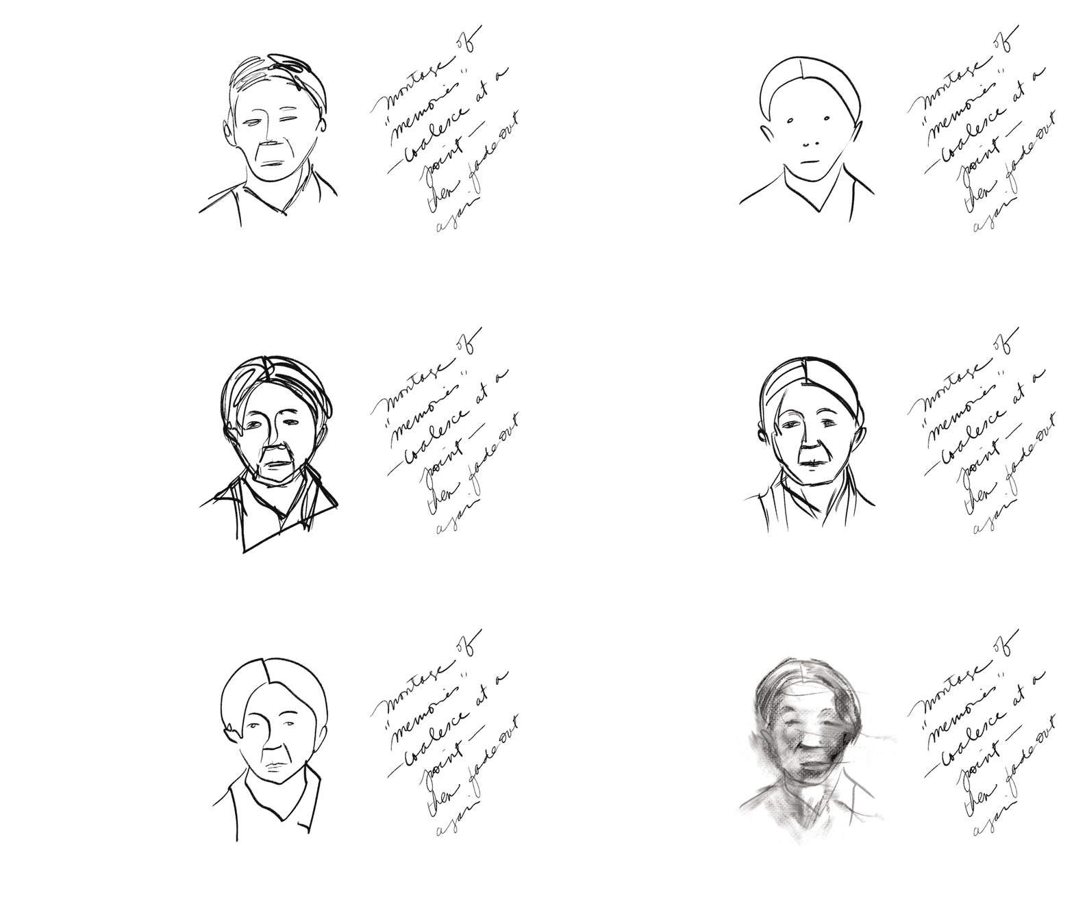
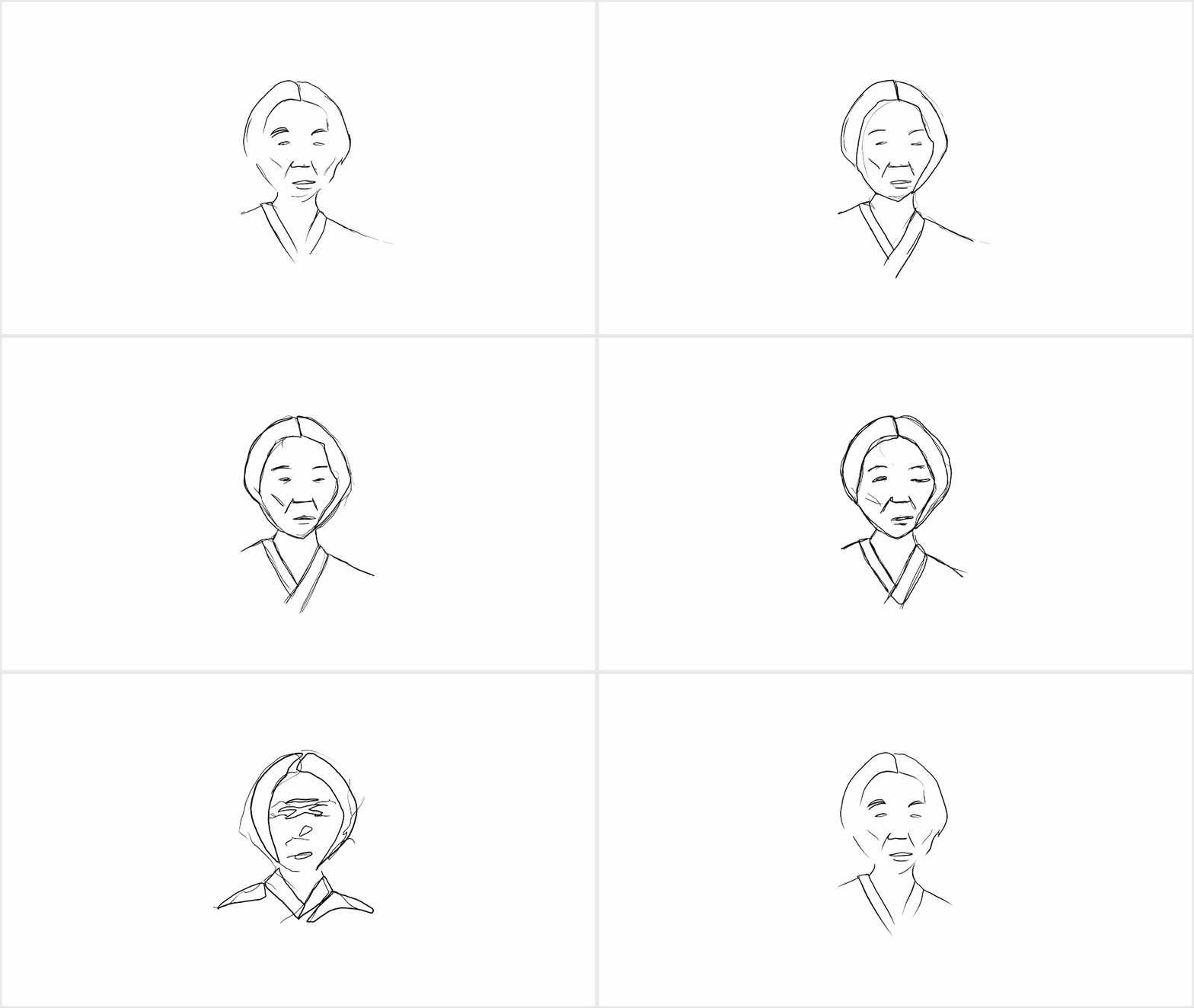
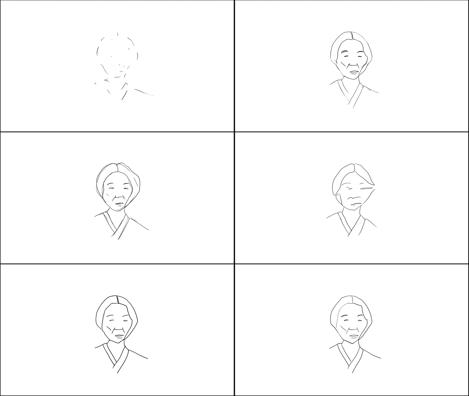
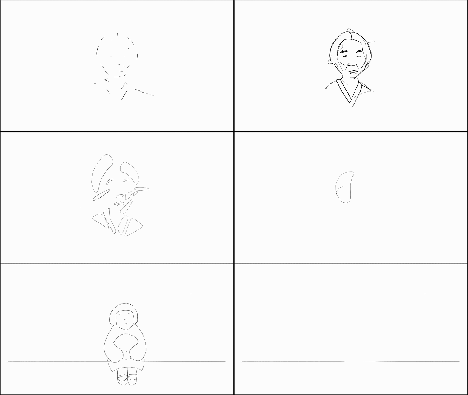
WIP: the style primer, a progression in animated GIFs
A Very Good Tip
Provisions
What does the project want?
I want to make something. How does it become what it wants to be?
Is that different from what I want it to be?
After painting, animating, and writing things for a while, I’ve come to feel that I’ve more to do with the execution of the work (how well or poorly they are realized) versus what they become. The work often surprises me, and if I’m open enough, it goes to unexpected places. Afterward I sometimes think: did that come from me? A realized work can feel like something apart, much as one’s child might feel both of and not of you.
The work comes from me but it is in many ways its own entity.
I’ve heard some variant of this line of thinking from artists like George Saunders, the Brothers Quay, and others: letting an idea reveal itself, versus trying to mold with a heavy hand.
In any case, making something seems to require more negotiation than brute direction.
Instead of: what will I do, how will I do it, what do I want this to be, I’ve been trying to ask:
what does the project call for? How does it want to be framed? What does it want to be?
The same questions, perhaps, from a different angle—but this other vantage point is what allows me to see things that may have previously been hidden.
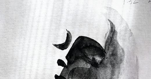
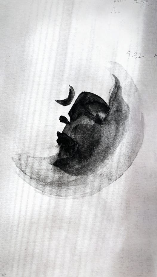
For example, I dove into explorations for Chamoe thinking I wanted to use traditional watercolors. I seem to have an allergy to defined edges so was hoping this medium, with its loose and evocative feel, would work out well. (Entering the exercise with an agenda, however unintentional, almost led me to dismiss options out of hand; I would confront my biases many times during the development of the style primer.)
As it turns out, watercolors in still frame feel very different from watercolors in moving picture.

While the effect was interesting, it didn’t feel right for Chamoe. Further, I didn’t feel that the extra effort was worth the aesthetic wins.
It felt like the work was leading me elsewhere, so I shifted gears as I continued with the style primer.
WIP: the style primer, a progression in animated GIFs
A style primer, as I like to call it, is a sort of developing visual exemplar that I can use to ground myself as I work.
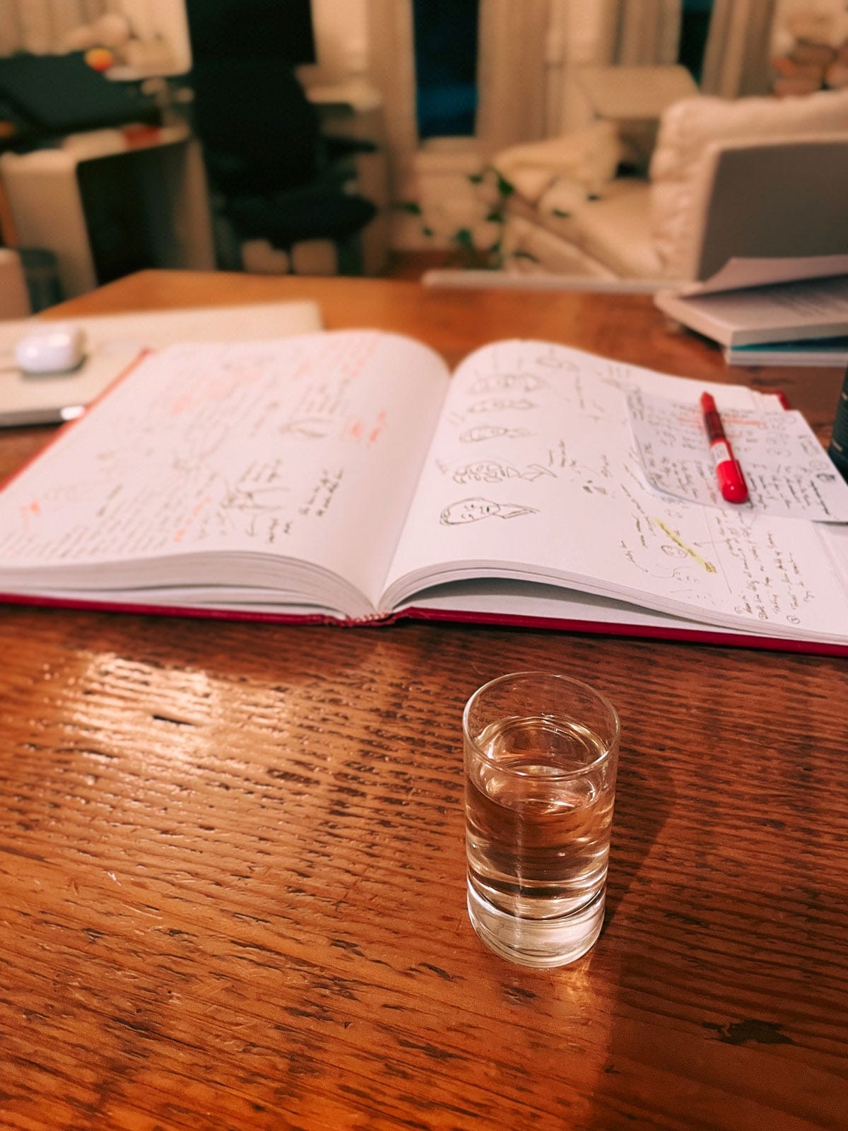
Analog or fully digital, as with Tuscany? Acrylic or oil? Black and white? Cool or warm? Whiskey or tequila? Such are the kind of questions I engage with during this process.
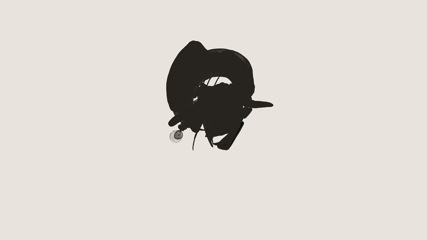
Rather than continuing with watercolors, I decided to move forward with digital paint for the time being.
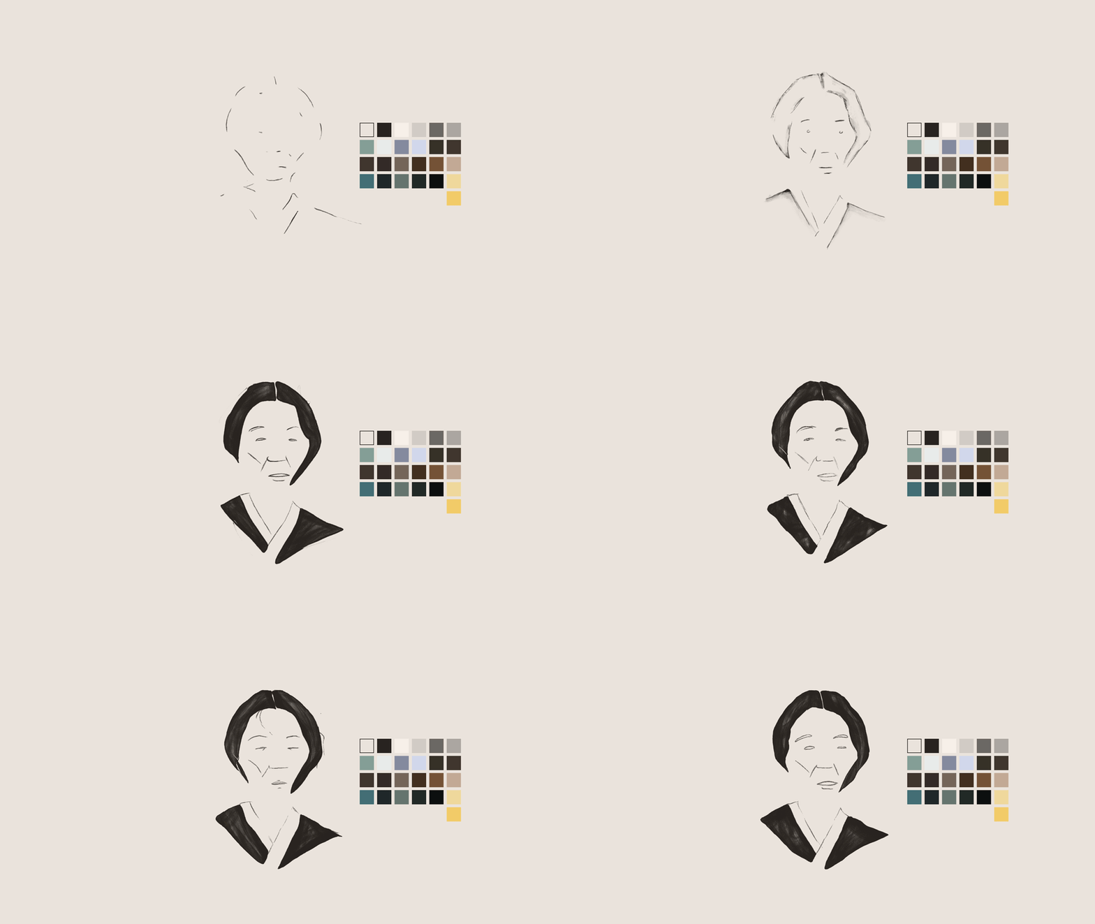
I took the first 188 frames of the animatic (just under 8 seconds of the animated storyboard) to work on the style primer, and I thought it might be fun to show you a rough progression through animated GIFs, which I sometimes use to assess progress as I go.
Here’s a sampling of shorter snippets out of the pile:
I also like trying things out on different parts of a sequence to mitigate fatigue and blindness. Here I’m trying out bolder, heavier brush strokes and cleaner definition of shapes, on later frames:
Exploring dissipating fills, with a slight textural difference:
I’m now ready to propagate new decisions through the full 188 frame sequence.
I will take these pretty far stylistically, because I want to see how the aesthetic holds up in a contained phrase. In other words, at the end I’ll have an 8 second animation that will look fairly finished.
Completing an animation a segment at a time versus in a more “waterfall” fashion (lines for all segments, then color for all segments, etc.) is a practice I started with Tuscany.
It’s a byproduct of wanting to straddle completion and iteration, and wanting to share refined glimpses before having to finish the entire project first.
It also allows me to iterate more quickly, and with a broader understanding of the problems I need to solve.
Here are the first 35 painted frames of this 188 frame segment, just for the base layer (3 additional distortion and texture layers will go over this):
As you can see this is a departure from where I began exploring style-wise. Things could, of course, shift again!
I’ll be listening.
A Very Good Tip
Take breaks.
I use an RSI timer while I work on the Cintiq pen display because sitting so close to a screen strains my eyes big time. It’s been surprisingly difficult to find a good, simple tool but Time Out fits the bill. I’ve been using it for years.
I set it for 10 second breaks every 10 minutes when I stare off into the distance to relax the eye muscles.
Provisions
Take in good things, make good things.
Tangy Tart Hot & Sweet is Padma Lakshmi’s cookbook in reprint after its debut 14 years ago. The recipes are very good, with Italian, American, and Indian flavors throughout.
Finding Peace at Brasserie Lipp is a beautiful little essay about a little sanctuary in Paris for lit and cocktail lovers. It made me incredibly nostalgic.
Nan Goldin’s solo exhibit, Memory Lost, at The Marian Goodman Gallery in NYC until the 12th, is multiple floors of luminous.
Solitude is beautiful
One of the greatest gifts in life is a room of my own.
Until next time.







Super interesting breakdown! It's great to see an animation newsletter on Substack that delves directly into process like this. We're looking forward to your next update!
Lovely... I really enjoyed this. I'm working on a large (large for me) visual memoir project that I am "listening to" in a way I haven't done before. Since I started a year and a half ago there's been a niggling voice telling me I need to deal with STRUCTURE... but I haven't yet been able to make myself do it. Still enjoying listening and doing too much.